
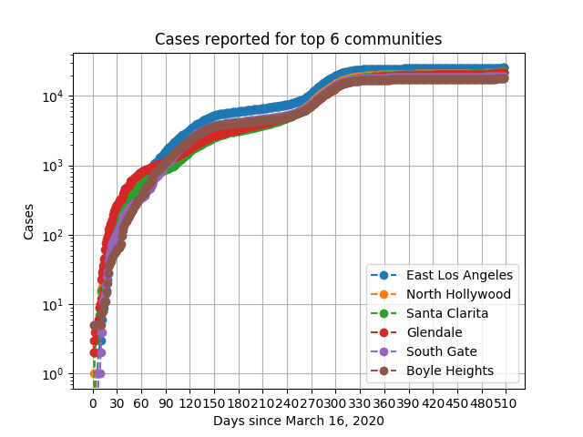
The following plots show time-series data for confirmed COVID-19 positive cases (daily, with linear and log-scaled axes) in the communities and cities within LA County that are showing the most number of cases. The data for these plots are collected from the press releases of Los Angeles County Department of Public Health. We have developed scripts in Python to fetch the data from the online press releases and save it in a machine-friendly JSON format. Please see our github repository containing open-source release of our software, data, and these plots. We are planning to update the data and plots on a daily basis going forward, and providing other tools that may be useful for researchers and policy makers.
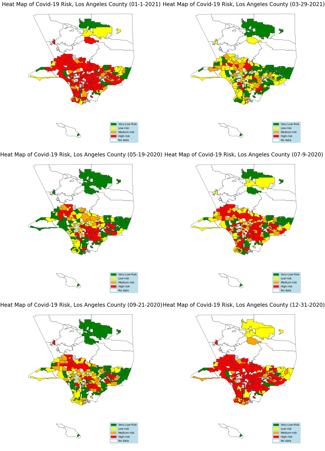
We have also developed a rigorous hybrid model-and-data-driven Bayesian approach to risk scoring based on a time-varying SIR epidemic model that yields a simplified color-coded risk level for each community. The risk score corresponds to the probability of someone currently healthy getting infected with COVID-19 in the near future. Code is open-sourced here.


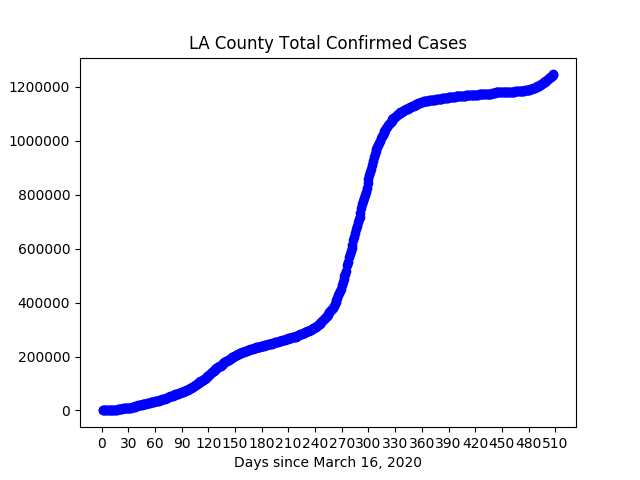
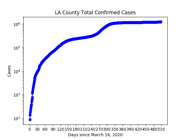
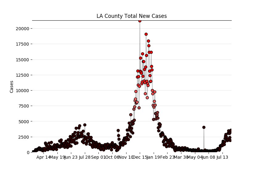
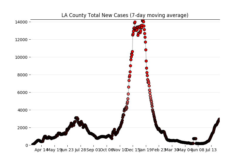
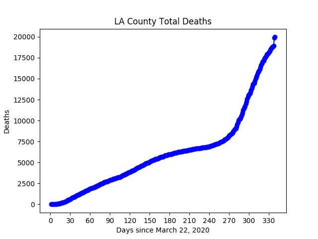
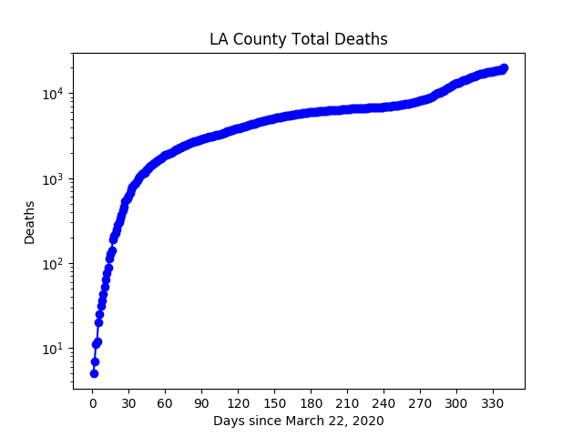
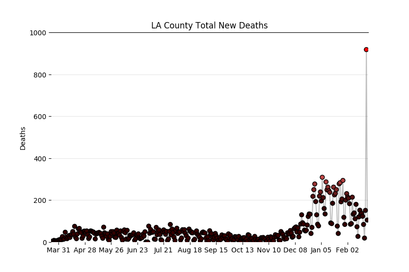
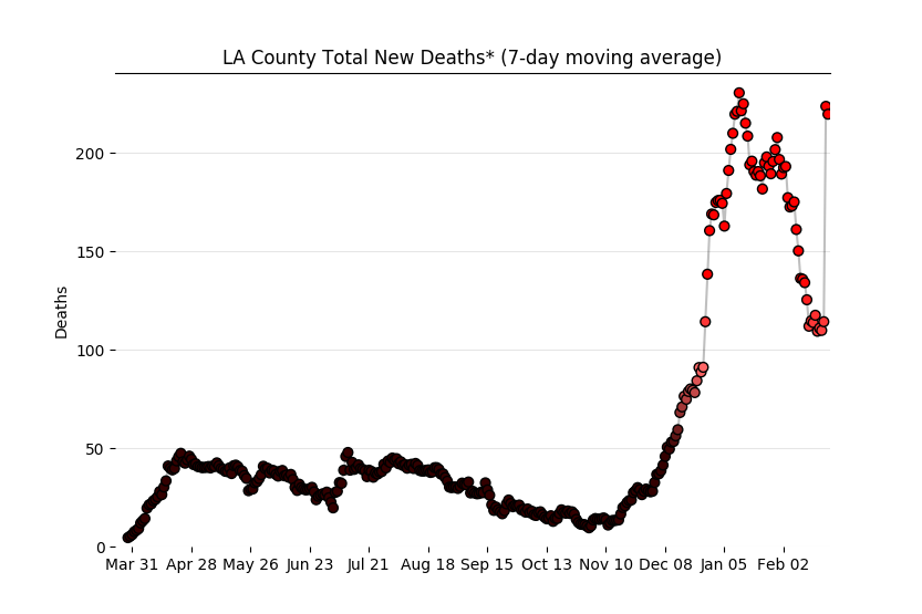
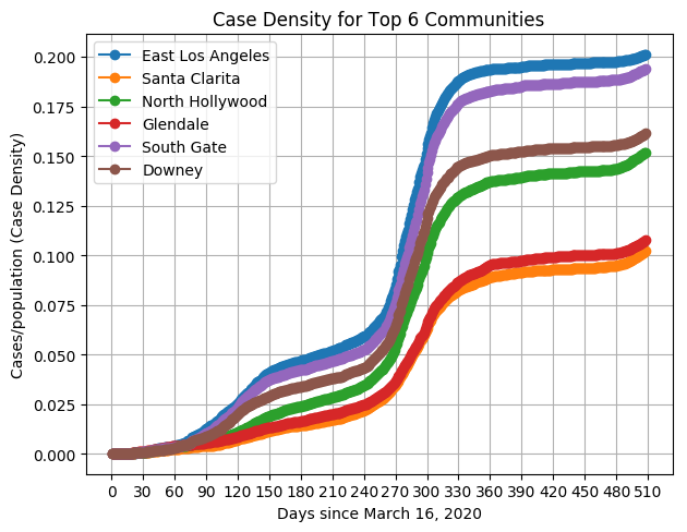
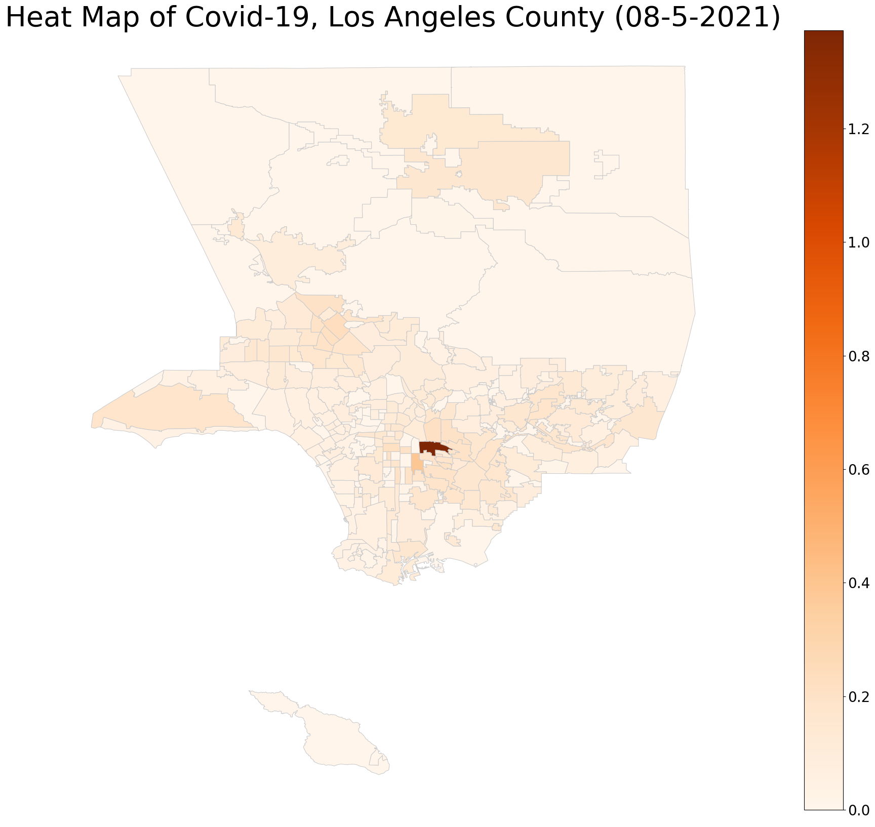
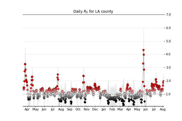
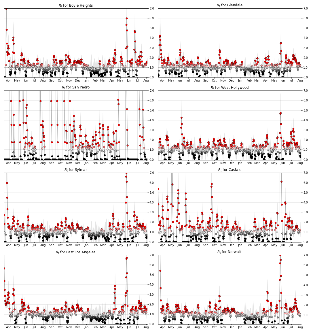
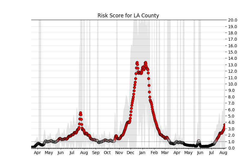
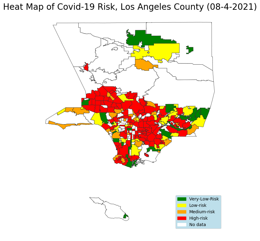
* The LA county did not release case data for communities and the death count for July 3rd, 4th, and 5th due to system upgrades. We have interpolated case data for those days and used that data to generate plots and risk scores. In the case of death counts, the death rate plots currently show zero deaths for July 3rd, 4th, and 5th. Starting from the 6th of July, the LA county started reporting case data for communities, death counts, and total cases for LA county.
This page is originally created on March 28, 2020, and it was last updated on Aug. 5, 2021. Autonomous Networks Research Group, Viterbi School of Engineering, University of Southern California, Los Angeles, CA 90089.
Contributors: Mehrdad Kiamari, Quynh Nguyen, Gowri Ramachandran, and Bhaskar Krishnamachari